Grey’s Anatomy: The show’s entire 18-season web of romances, visualized

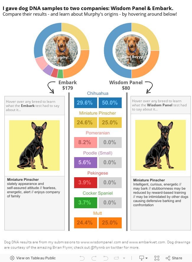
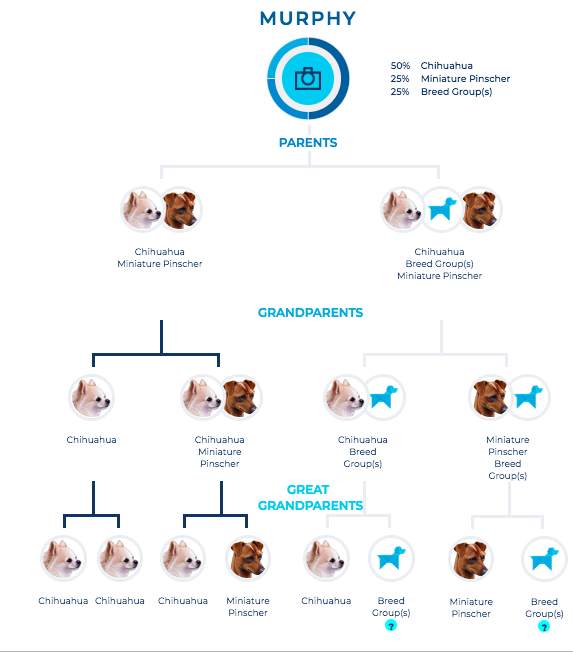
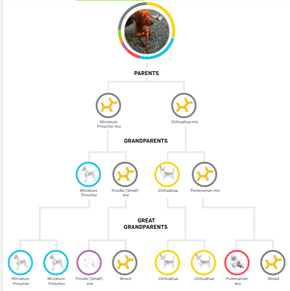
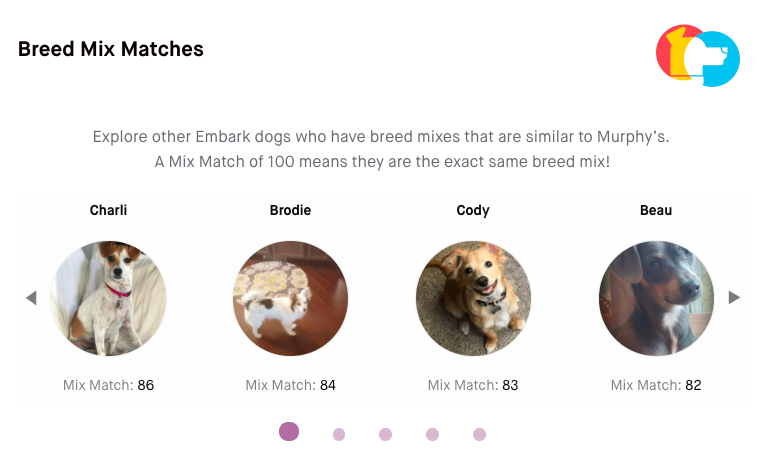
Season 19 of Grey’s Anatomy premieres later this week, and I am one of the many dedicated fans who has been with the show since Day One. I remember in college, in the pre-streaming era, I bought a cheap VCR for the sole reason of recording Grey’s episodes during my evening chem lab. I can tell you exactly where I was when I watched the bazooka bomb episode guest starring Christina Ricci and Kyle Chandler. This show has been a constant for me over the past 18 seasons (wow!) spanning 17 years (WOW!).

And in these glorious 18 seasons, the Grey’s universe has accumulated an enormous amount of mess among its characters. There are love stories, heartbreaks, one night stands, family drama, spinoff shows, workplace feuds, physical fights, natural disasters, tragedies – I could (and might) go on.

Earlier this summer, I was brainstorming infographic ideas for this blog and was drawing inspiration from the abundance of data out there about The Bachelor franchise. My most popular blog post is a Bachelor data interactive; the Instagram account @BachelorData has a huge following; there is even an entire book about Bachelor game statistics called How to Win The Bachelor. It occurred to me that, with 18 seasons of Grey’s under our belts, there is so much data to extract about Grey’s storylines – plus a huge fan base out there who might find it interesting to nerd out on. Just like there is this huge community in Bachelor Nation, is there perhaps an underserved market of Grey’s dataheads?

So now, three months after I began this research project, and with only a few days left before more romantic entanglements ensue in the S19 premiere, I am extremely proud to present my very first Grey’s data infographic. This is essentially a network diagram which visualizes the various romantic connections (“links”) among the characters (“nodes”). Note that the Grey’s universe is huge, and as such this graphic is best seen in full-screen, zoom-in, high-res mode here.

This infographic is huge. Zoom in and out here!

There are so many different flavors of romantic connections I considered – past vs present, unrequited vs consummated, on-screen vs off-screen. I developed these rules below to determine which relationships were important enough to qualify for this infographic:

What kinds of “nodes” and “links” are eligible to appear here?

  • Characters who are eligible to appear as “nodes” must be at least one of the following:
    • (a) series regulars with at least 1 romantic link
    • (b) 1st degree romantic links to series regulars
    • or (c) 2nd degree links to a series regular as long as this person’s 1st degree link is with any Grey-Sloan Memorial (GSM) doctor.
  • Characters and any of their eligible connections also must also meet all of the following criteria:
    • (a) credited in at least 1 Grey’s Anatomy main show episode
    • (b) physically appears in in a “present day” storyline
    • and (c) has at least a first name.
  • Characters are given a romantic connection if they, at minimum, have either had sex or have a dating history that goes beyond a one-time date.
  • The occurrence of two characters’ romantic connection can happen at any point (on-screen or off-screen, historical or future to their appearance, or even in separate spinoff show episodes) — as long as each character at one point appears in a “present day” Grey’s Anatomy storyline.
  • Familial links (parent/child or siblings) are shown between characters who have other romantic entanglements, to visualize the family drama also afoot.

What kinds of “nodes” and “links” were excluded?

  • Two characters are not given a romantic connection in these scenarios:
    • (a) they have only been on one sex-less date (e.g., Derek Shepherd’s awkward date with Sydney Heron)
    • (b) they only kiss briefly then one or both parties puts a stop to it (e.g., Jordan Wright kisses Miranda Bailey but she’s having none of it; Alex Karev and April Kepner kiss once, but when he tries to go further she stops him and he storms off)
    • (c) one or both characters have romantic feelings but never act on it (e.g., Lexie Grey’s crush on George O’Malley, Taryn Helms’s crush on Meredith Grey)
    • (d) one character never appears on a present day Grey’s Anatomy storyline (e.g., Teddy Altman’s late ex-girlfriend Allison who dies in a 9/11 flashback)
    • or (e) they are only romantically connected to someone who is not a Grey-Sloan doctor (e.g., Thatcher Grey’s second and third wives).
  • If a romantic partner is only discussed but the character never appears present day, this person/link is not shown.
    • This “disqualifies” exes who never appear or only appear as flashbacks (e.g., due to estrangement or death) — which unfortunately disqualifies important backstories, like Tom Koracick’s late wife Dana.
    • This was a tough decision, but I had to draw the line somewhere. This prevents the chart from getting clogged up any time a character offhandedly mentions an off-screen/historical ex-lover.
  • While familial links are shown where they exist, family members are not listed here unless they have a primary or secondary romantic connection to a series regular themselves

And of course I did more than just draw out the connections; I crunched those numbers, too. Here you can see, of the 21 “main characters,” who has the most 1st degree romantic partners (i.e., direct connections) as well as who have the most 1st degree + 2nd degree partners (i.e., your partners plus your partners’ partners).

This is basically the social network diagram above, distilled into key character stats

For Grey’s fans, it’s not surprising to see Alex Karev and Mark Sloan at the top of the “most number of partners” ranking. They both were known for being promiscuous around the hospital, and they both were given longer-term romantic storylines. I was pleasantly surprised to see Jo Wilson so high – this means the writers are giving her a complicated personal life (great for her screen time!) and as one of the only main characters who is presently single, I could see her increasing her partner count in coming episodes. Her romantic connectedness also means that anyone who newly becomes linked to Jo will immediately have high drama potential.

One of the most interesting parts of this analysis for me was the “1st + 2nd degree hookups.” This tells us not just how many partners the character had, but how entangled their chosen partners are with other characters on the show. For example: While Meredith is #3 in direct partners, her partners aren’t likely to have relationships with others on the show; as Meredith is the lead, I think this protects her from getting into petty interpersonal drama.

Speaking of protection, Miranda Bailey is completely isolated from the drama. While she is given 3 romantic partners over the past 18 seasons, none of these 3 partners ever have an on-screen romance with anyone else. Bailey is often the moral compass and the authority figure; again, this feels like a choice to protect her storylines and her reputation.


One last thing I made for this analysis: If you follow me (@huskerdana on Instagram), you’ll see I posted a main grid carousel for the first time with an “explainer” of this infographic! Here is the slide show I’m putting on social:

You can zoom in on this snippet here

Why have I never broken up my analyses into a carousel like this?! It’s so cute! I’ve been honestly inspired by @BachelorData, who creates fun, engaging, easy-to-share videos and multi-slide posts to really make sure the world sees all the hard work she does to capture data about The Bachelor. Plus I’ve been learning Adobe Illustrator and Adobe XD, so I feel like my toolkit is growing in a really creative way. This entire effort took me several months, and I’m honestly so proud of it. I hope dipping my toes into some new design software & new social media techniques will help this infographic reach as many of my fellow Grey’s enthusiasts as possible.

There is so much untapped potential in this Grey’s Anatomy data, and so much to unpack with my fellow Grey’s dataheads. Should I dive deeper into the romantic connection data? Collect new storyline data points? Quantify the ways in which the show has evolved over time? Comment below!

-Dd

Eling’s Famous Seven Layer Dip: my first-ever recipe infographic

Seven Layer Dip Infographic

Hot take? In general, recipes are pretty terrible information design. They’re written as if cooking follows a neat linear path. But what if there are steps that belong together? What work can simmer in the background while I multitask on an upcoming part? Where are the natural divisions of labor so another person can pitch in? Cooking a meal is 3-dimensional choreography; most recipes are flat, linear, one-way roads. 

(A couple notable exceptions: I love how HelloFresh breaks down their recipes in a visual, compact card with clear phases. Molly Baz’s Cook This Book helpfully chunks the recipe into its component goals, and uses neat QR codes for technique how-tos.)

The worst offenders are recipes that involve layering – like dips, lasagnas, desserts. The information on the page flows from top to bottom, all while you’re building in a dish from the bottom-up. I always end up with layers that are over-distributed, under-distributed, misplaced, or skipped altogether. It would be so much easier to see how the layers stack up as a visual, and follow along as you’re building alongside the image. Imagine that: A recipe that flows the same way my dish does.

Enter: Eling’s famous Seven Layer Dip. This impeccable dip comes from the mind & kitchen of Eling Tsai – who is an incredible home chef, a bona fide registered dietician, and one of my very best friends on this earth. I don’t have receipts from when she first shared this gem with me, but I have an iPhone note I created about 7 years ago which has been my layer dip bible over ever since. Not exaggerating, when I bring this dip to a party, the entire casserole dish is wiped completely clean.

A couple months ago, I got the idea that I wanted to do something with this cherished recipe. I was horrified by the idea of ever losing the iPhone Note. I wanted to memorialize the Seven Layer Dip as an infographic, forever living in internet permanence, for the world to be able to know how amazing Eling’s creation is. I sketched many, many ideas on loose printer paper around my house – I imagined blueprints, technical diagrams, all sorts of non-traditional recipe formats to really visualize how the end product comes together.

Unfortunately, there was a problem. I had all these ideas, but not the design skills to get even close to executing it. My background is in Tableau, slides, and spreadsheets. The vision in my brain was beyond the limit of what my PowerPoint skills (while mighty!) could do. 

After a little research on what tools could bring my concept to life, I settled on Adobe Illustrator. Am I saying I took an entire summer quarter class at UCLA so I could make a Seven Layer Dip infographic? I’d say this is 50% true; this recipe infographic was more so the final straw that pushed me to learn something beyond my current means. But, y’all. I am only 4 weeks into this class and this is the level of what I’m able to create! I’m sure I will look back and nitpick it, but I’m really proud! I can’t wait to see what other infographic ideas I can unlock with this new toolkit. Here is the class info if others are interested.

Worry not – I am certainly not saying goodbye to the DataDana that brings you hypernerdy Tableau interactives. But I am excited to be able to broaden my dorky side project horizons. (And yes – I’ve even started using Illustrator at work. I can’t believe how much hacky stuff I was trying to do in Google Slides all these years!!)

Do you have any recipes that you wish were visualized? Anyone else loving Illustrator for their data work? Comment away, dataheads!

-Dd

P.S. For those learning Illustrator, know that it is taking lots of time and practice. It’s worth getting the hang of that frustrating pen tool, the mechanics of text wrapping, the value of well-organized layers. I’ve come a long way; check out my attempt to draw a bean in week 3.

On Being in Denial About the 2021 Nebraska Football Season

2021 was a tough year to be a Nebraska football fan. Nay, it’s been a rough half decade.

Let me hit you with some sad facts: We haven’t had even a winning season since 2016, let alone a season competitive for a conference title or (ha!) national championship. Our head coach, Scott Frost, started with much fanfare in 2018 – but he hasn’t secured more than 5 wins in a single season, ending 2021 with a cumulative 15-29 record as the Huskers’ head coach.

But at least this year, our dreadful 3-9 record doesn’t feel like the whole story. Every single one of our nine losses has been by single digits. We’re hanging in there no matter the opponent, never getting blown out. Six of our painful losses were to ranked teams – heartbreakers that came down to the final seconds.

“Nebraska is a better team than its record shows.” That’s not just what us delusional cornheads are saying. It’s been an oft-repeated talking point from sportscasters, sports podcasters, and journalists. And I gotta say, it feels so true. We felt competitive with the top teams in the country. I feel real hope that the pieces will come together by (fingers crossed) next season.

But how do we measure this sentiment? If we believe our Win-Loss record underestimates us, what are other ways to quantify the Big Red?

Quick disclaimer: the Tableau interactives render best on desktop. Sorry to my mobile dataheads!

To explore this question, I gathered data on every game played by the 64 teams who belong to a Power Five conference (ACC, Big 12, Big Ten, Pac 12, SEC), through Week 13 of the season. Most teams are done with the regular season by now, including (mercifully) the Huskers.

Let’s start with the basics: wins and losses. This graph shows all Power Five teams, sorted by most wins (go, Dawgs) to most losses (sorry, Wildcats). Since strength of schedule is relevant to Nebraska’s storyline, I also highlighted which of these games were against a ranked opponent.

Right away, you can see that Nebraska is an outlier. SIX LOSSES TO RANKED TEAMS! If our opponents weren’t so strong, maybe we would have banked a few more W’s. What’s crazy is that 94% of Power Five teams didn’t even play against six ranked teams all season. 

But this chart doesn’t capture just how close our losses were. In this version, I show number of losses (on the x-axis) plotted against the average loss margin (on the y-axis). Some super interesting trends:

  • Teams that lose rarely, tend to lose in close games. Basically, if you’re a team on the bottom-left, you’re pretty good. You only had a couple of losses, which were super tight games. Think: Alabama, Oklahoma State, Michigan.
  • Teams that lose often, tend to lose by a lot. If you’re a team on the top-right, you’re having a rough season. You had a lot of losses, and your losses tend to be by a lot. Think: Kansas, Duke, Arizona.
  • Nebraska lives on its own in the bottom-right – lots of losses, all of which were close. Usually, teams that lose often get blown out. We managed to be uncommonly competitive in these losses.

I think this visualizes why Nebraska doesn’t feel like a 9-loss team. The other 9-loss teams (Duke, Georgia Tech, Northwestern, Stanford) suffered an average loss margin of 22.75 points per loss. Nebraska ended the year with an average loss margin of just 6.22. It’s weird, it’s frustrating, it’s interesting.

In fact, if you plug in a trend line here, you’ll see a statistically significant correlation between losses and loss margin. This correlation says that good teams (few losses) lose by a little, bad teams (lots of losses) lose by a lot.

So let’s plug Nebraska into the regression formula. “Hey, trendline! If all we knew about Nebraska was that it had a 6.22-point loss margin, what would you predict Nebraska’s record was?” This super simple model predicts that the Huskers would have 2 or 3 losses. Nowhere near our astonishing 9 losses. 

One potential factor: the Big Ten conference was super weird this year. Let me show you what I mean.

You can see, for most conferences, that the correlation above remains true. Good teams have close losses, bad teams get blown out. This is true and statistically significant for the ACC, the Big 12, and the SEC. The Pac 12 is a little thrown off by Oregon (who had a bad loss to Utah a couple weeks ago), but if you exclude them the trend is the expected, statistically significant correlation.

But the Big Ten? It’s all over the damn place. There is no trendline. Somehow everyone looks like an outlier.

Why is this happening? I could hypothesize forever – maybe the Big Ten has lots of strong coaches, maybe even our worst teams have decent programs, maybe players have been emotionally unpredictable as this season’s Great British Bake-Off unfolded. All I know is that the Big Ten is weird, and it’s one of the factors that drove Nebraska’s extremely weird season.

Does any of this matter? No, I know, the wins matter. And we didn’t get many of ‘em. But does it make me feel better? Like something positive came out of these past four months? Like Nebraska football isn’t a hopeless waste of a pastime?

Yes to all! This analysis will keep my denial alive and well during the long offseason.

Until next time, thanks for tuning in dataheads. Congrats to the teams who made it to the post-season, and happy holidays to all (even Ohio State fans).

Dd

Inventing a new holiday for you & your dog: Calculate and celebrate your Lap Day!

We’re now 11 months into the COVID-19 pandemic, and quarantine has been a slog. I am fortunate that my job allows me to work from home. But it also means day after day I’m in the same room, staring at the same laptop, bouncing off the same walls. A silver lining for me is that I get to spend nearly every hour with my dog, Murphy. (Yep, same Murph from my previous post on his dog DNA results.)

I try to pass the quarantimes by planning events & milestones to look forward to. It helps mark the passing of time in otherwise monotonous weeks and months. Shocker: many of these plans & milestones center around my trusty companion Murphy.

A couple months ago, we celebrated his fourth birthday. (He got the biggest bully stick we could buy at Tailwaggers pet store.) Earlier this year, we observed his third annual “Gotcha Day,” i.e., the anniversary of his adoption day. (I swear this is a common and not insane milestone among dog owners, especially those who adopted shelter dogs with exact birthdays unknown.)

Trying to think of more Murphy-centered holidays, I had a conversation with friends about the concept of human years & dog years; how, at some point in our lifespans — some exact date even — Murphy’s “age” will intercept with mine.

Me being me, I spun up an interactive Tableau calculator to pinpoint this day. We debated a few different options for what to call this date — this planetary alignment that only happens once ever for any person-dog pair. We brainstormed “Your Dog Eclipse Day,” “Catch Up Day,” “Convergence Day.” We researched the web and Reddit to see if there was a common phrase for this, and found just one Medium post on the topic, calling it “Same Age Day.” But all in all, the branding of this event seemed up for grabs.

What I’ve decided to hereby dub this auspicious occasion, is Lap Day! The once-in-your-lifetime date that your dog begins to “lap” you in age. I like it because the word “lap” has a lot of dog associations (lap dogs, lapping water, etc.), and it’s kind of a play on Leap Day.

So, here you go world! Your interactive, personalized Lap Day calculator:

One caveat: This calculator assumes 1 human year = 7 dog years. I realize this is an old heuristic. Veterinarians today agree that a dog’s body and brain mature at different rates and different times in its life, with a much faster rate of growth early (Year 1 of a dog’s life = 15 years of a human’s life) and a slower rate later (Year 10 of a dog’s life = 4 years of a human’s life). But the 7:1 rule is more colloquial, and for me it’s less about “when is my dog as mature as a 30-year-old” and more about finding this neat mathematical intercept.

So I have marked my calendar for September 8th of this year (yay, a plan!), and I will be planning a COVID-guideline-appropriate blowout for mine & Murphy’s special day.

Thanks for reading, y’all. Stay safe & give your dog a pet from me.

-Dd

The Very First Full 1,042-Member Bachelor Nation Family Tree

I was reeled into the Bachelor universe in the winter of 2010. As a graduate student paying non-Nebraska(!) rent for the first time, cable was definitely out of my budget. Instead, I had a crappy second-hand antenna that could only get the local ABC channel. 

When it was time to unwind, I would turn my brain off, adjust my precarious antenna, and let whatever was on ABC wash over me. My escapes from the stress of school weremy daily Jeopardy, my Grey’s Anatomy Thursdays, and my Bachelor Mondays.

I had never watched a Bachelor show before, even though it’d been in the cultural zeitgeist since 2002. When I finally tuned in eight years later that fateful January, I had the pleasure of watching 25 ladies (of varying mental stability) compete for the love of airline pilot Jake Pavelka. In a series of questionable decision-making, Jake proposed to Vienna in the taped final rose ceremony, only to have a bitter, uncomfortable, on-air post-breakup blowout in the live finale. (BREATHTAKING.) And then, because the franchise upcycles previous contestants to become the next lead, I was instantly invested in the next Bachelorette’s second-chance storyline. It’s at the same time a vicious cycle and a riveting pop culture machine.

How I’ve made it this far as a data enthusiast without doing a Bachelor analysis is a mystery. I think I was intimidated by the amazing analyses already out there from the likes of FiveThirtyEight and The Ringer. What could I possibly add?

As I started roping in Bachelor newbies to drink wine, eat cheese, and enjoy Bachelor Mondays with me, I found myself trying to explain the origin story of each character — whose season they were on, how long they lasted, their off-camera instagram feuds, what crazy occupation they purported to have. And I realized, while there are a number of great meta-analyses and deep dives, there aren’t a lot of person-level interactives that let you explore the entire franchise alumni network, from the first contestant out of the limo to the last final rose.

So, for the first time that I’m aware of, here is an infographic of every single Bachelor cast member of all time, interactive and hover-able for detailed deep-diving. This is what I’ve dubbed, The Bachelor Family Tree. Disclaimer: with a franchise that’s 17 years old and counting, it’ll take a few scrolls.

Creating this, I found myself smiling at the “careers” attributed to the contestants. The word former is often prefixed, presumably because the person quit their job to pursue reality TV or was conveniently already unemployed. With my new Bachelor database, I could explore my curiosity. I decided to break down what career types we see most often, in the interactive below. Go ahead! Type in your job, and see what previous contestants had it. (Only 1 contestant had the word “data” in their occupation. Hello, John Wolfner from Emily Maynard’s season, ya fellow datahead!)

Here, you can definitely see the gender-normative jobs for women (child care, teaching) as well as men (construction, engineering). But there is some unexpected parity. For instance, there is a fairly equal number of male/female lawyers and personal trainers. It’s also interesting to see, overall, what job types are common or uncommon. A lot of people in Sales, which makes sense if you think of a stereotypically outgoing (read: camera ready) salesperson. Not a lot of people in politics, probably because of the exposure downside; hope your tequila company works out, Luke Stone. Younger women are “Students” (because they’re on the show before starting a career), older men are Doctors (because it takes a post-graduate education). It’s a fun albeit skewed sample of the millenial job pool. Funeral director. Jumbotron operator. Italian prince. Not so different from your LinkedIn network, right?

The last thing I thought folks would want to explore is age. Our most recent Bachelorette, Hannah Brown, is the youngest lead ever at age 24. She picked the youngest ever male suitor (Jed Wyatt, age 25). Our oldest ever lead, Byron Velvick (age 40) in a surprising good-for-you move had the oldest cast (average of 31 years) and the oldest female winner (Mary Delgado, age 35). So I thought I’d not only visualize the age distribution of Bachelor Nation, but the ages of contestants relative to their lead for some matchmaking context. 

As I expected, every single Bachelor had a cast on average younger than him. All but three Bachelorettes had a cast older than her. Except for Byron’s season, the average age is predictably between 24 and 29 for both genders of contestants. While this is interesting from a data perspective, it also makes a certain amount of common sense. The number of beautiful, compelling, eligible people (who are also willing to compete on a reality dating show) likely drops off with age.

I could make a dozen more interactives with this data. And I might, later. Much later. This was probably my most intensive project thus far for the blog. Creating a database of all these contestants, organizing a timeline, reading decade-old articles; I felt like Michelle McNamara researching the Golden State Killer but waaaaay more pointless. But I know I learned a lot (one of the O’Connell brothers was the Bachelor, guys! nope, not the one you know!), and I hope my beloved readers enjoy the fruits of my nonsensical labors.

Happy Bach-ing, dataheads.
-Dd

Dog DNA Data – Comparing the Top Two Testing Companies (a.k.a. my thinly-veiled excuse to write about my pup)

Happy Holidays from a finely decorated Murphy boy.

This January, I adopted Murphy. He is a sweet, spastic, adorable, aggravating, two-year-old mutt.

When I spotted him on the rescue agency’s “adoptable dogs” page (which I had been obsessively monitoring for months), I fell in love with his long spindly spiderlegs; his enormous baby deer eyes; his gorgeous auburn coat. Also, they mentioned that he was found in a field way out in San Bernardino County. My heart both broke and melted.

The agency gave him the name Murphy, and I thought it suited the little guy perfectly. I didn’t overthink it. He’s Murphy. And now he’s mine.

But the agency also gave me something that I just couldn’t sit with unchallenged. They guessed his breed to be an Italian Greyhound / Manchester Terrier mix. But I kept staring at his spindle legs, his doe eyes, his ginger fur. Thinking, “Is that rightReally??” He’s long like a Dachshund. He’s red like a Vizsla. He certainly is fast and skinny like an Italian Greyhound – but I knew that couldn’t be the whole story.

These are Italian Greyhounds (left) and a Manchester Terrier (right) from previous Westminster dog shows. It’s not a bad guess for Murphy, right?

After spending weeks speculating, Google image searching, and trying to stare deep into Murphy’s soul, I decided it needed to be settled once and for all. Enough wheel-spinning. I needed to get his DNA analyzed.

I hear that veterinarians balk at dog DNA tests. They say they’re not reliable, not accurate, not relevant. But to reword the famous quote from statistician George Box: all data is wrong, but some is useful. Having some objective insight is better than none.

But me being me, I couldn’t just stop at one answer. I, for some harebrained and probably wine-driven rationale, decided to buy two dog DNA tests. Even if they’re not reliable, I could see if they at least corroborated each other.

So, after two mouth swabs, two eagerly awaited notification emails, and two emotional roller coasters (yes, I cried), I finally got the Murphy information I had craved since his adoption. Behold below: Murphy’s ancestry!

Turns out, Italian Greyhound was confidently ruled out. Sorry, Murph, you’re just not that fancy. The agency’s original Manchester Terrier guess wasn’t bad, though, since it’s a breed that is related to one of his top breeds of Miniature Pinscher.

The biggest shocker shouldn’t have shocked me. Of course this dude is a Chihuahua!! I live in Southern California. Chihuahuas make up 30%-40% of all shelter dogs in the state. By pure statistical chance, he’s more likely to be a Chihuahua than anything else. I’m guessing there’s some “adoption gaming” going on with the shelters and rescue agencies. If you can pitch that a dog is unique, he stands out to prospective adopters. If people are reluctant to get “a yippy Chihuahua,” it’s better to present your rescue pup as a more amiable, more exotic breed. I get it. I don’t hate the game. It’s frankly how Murphman caught my eye.

Were these tests worth it? For me, 100%. I thrive on data. I flourish on learning. The DNA test didn’t change anything about Murphy, but it helped explain his various behaviors and instincts (so. much. defensive. barking.). But from a more visceral perspective? I think a lot about what Murphy’s life was like before I got him. Alone and stray in a field. Unneutered at one year old. Found with bite marks on his legs. Based on his reactivity when seeing strange dogs, he was probably neglected and poorly socialized. But these tests were a breath of fresh air. I now have some positive information about his life before me – his parents, his siblings, his genes. It just made me happy.

But assuming you’re not a data hoarder, and you only plan on buying from one company, which test is worth your money? Well, that depends what you want out of it. I put together this handy comparison of what comes in the “results package.”

TopicWisdom PanelEmbark
Cost$80$179
Breed BreakdownGood if you want to know the *top* breeds. It's more conservative about what breeds it's willing to "guess."Good if you want lots of fascinating details about other, low-genetic-percentage breeds. Which may be a less accurate, but certainly more interesting.
Results FormatPercentages and family treePercentages and family tree
Breed ExplanationsMore useful copy about the breed's typical behaviors...but then again, you can Google that stuff
CommunityNone that I sawYou can opt to share your results, and find other dogs that have similar genetic profiles as your pup! Eeee! This feature is. the. best.

love love love the community feature in Embark. I don’t know why, but looking at dogs that look like Murphy sets off all my endorphins. I think it’s me trying to find the happiness in Murphy’s past. He has a family. He has relatives. Maybe he has siblings out there I can find. MAYBE. HE’S. A. DAD.

I’m probably (absolutely) overly preoccupied with my dog. These tests are me injecting my obsession, writing this post is me feeding off the rush. I recognize my problem. Thanks for indulging me, dear readers.

If you have questions about these tests, I’d love to share my experience. Comment below!

Here’s Murphy’s family tree results from Wisdom Panel. Lots of Chihuahuas and Min Pins.


And here’s the family tree from Embark. Both pick up Chihuahua and Min Pin “branches,” but this one throws a Poodle and a Pom in the mix!


Embark shares the profiles of other dogs who have DNA like yours. And they all seem to be from Southern California, too. HI THERE GOOD DOGS.


I Viz For Beto

It’s almost Halloween, dataheads. And I came across quite the fright as I scrolled through Twitter today.

I got a promoted tweet for Texas Senate candidate Beto O’Rourke, soliciting campaign donations. And this data viz? Insert scary movie score here. Take a look.

What grinds my gears about this is that it violates a data visualization tenet: never be visually misleading. But here, it both misrepresents Beto’s position in the race and confounds his call-to-action for donations.

Why? Well, Beto’s “rainbow” takes up more real estate on the graphic than Cruz’s. It has more volume, more length, and has a longer arc. My brain looks at the picture, and before it has a chance to process the labels at the ends of the arcs (46% vs 50%), I might conclude that Beto has overtaken Cruz. So not only is it an inaccurate rendering, but it might actually make me think Beto doesn’t need my ten bucks.

Yes, I see that Cruz’s arc is more “complete,” I guess, than Beto’s (and I do like, visually, stacking Beto on top of Cruz to give a sense of victory). But this is marketing disguised as data.

The point of data visualization is that it capitalizes on our brain’s “pre-attentive attributes.” If designed well, when we look at an image, our eyes go immediately to the pattern we’re supposed to recognize — or the discrepancy we’re supposed to notice.

Image from:https://medium.com/design-at-zoopla/building-purposeful-ui-using-pre-attentive-attributes-9c5ee5dcc25c


So I played around with a couple different options for getting Beto’s message across while still representing the data truthfully and compellingly. I tried a few options with donut charts (which is what the original designer used, essentially). But differences in angle just aren’t that powerful to the eye, in my opinion. That’s why I’m loathe to use pie charts.

My first attempt. Not in love with it.


But then I realized, you can do some subtle things with font sizes and colors to make Beto stick out, without distorting the chart itself. In fact, simplifying the chart could actually make it more powerful!

Getting rid of the unnecessary curvature effect actually makes this better. And it gave me more options for playing around with the label size and colors. My eye can go to Beto (because he’s the important one in this ad), but my eye can also see that gap in the polling numbers.

Any other thoughts on ways to improve Beto’s message? Anyone else want to toss $10 Beto’s way? Comment away, dataheads.

-Dd

My Former Role Model is a Fraud. What Does That Make Me?

[Editor’s Note: This post deviates from my typical form. It’s purely an essay, no data viz. Thanks for reading as I try out something new.]

I first saw Elizabeth Holmes at a small health data conference in 2013. I went to these kinds of events often for work, and the typical entrepreneurs I encountered were “health app” developers. They gameify-ed your health goals, used your camera to track food, synced your music to your running pace. Most were flashy software products that, to me, didn’t do anything.

Theranos, the biotech company Elizabeth dropped out of Stanford to found at age 19, seemed totally different.

I first encountered Elizabeth Holmes, founder of Theranos, when she spoke at the pictured data conference I attended in 2013. Photo by Christopher Farber, WIRED.

Theranos wasn’t just 0’s and 1’s on a smartphone. It was a company creating actual physical machines – a miniature laboratory device that could operate off of just a drop of blood from your fingertip (rather than a typical blood draw, with a needle in your vein). This technology promised to significantly reduce costs by automating previously human-intensive lab work, and had the potential to improve access to critical test results in places where laboratory testing facilities weren’t easy to find. Elizabeth even talked about having these tiny units in people’s homes, where a person could log longitudinal blood samples to predict disease onset and prevent adverse trajectories (be still, my data-loving heart!).

I was attending the conference on behalf of the cancer hospital I worked at, and as I sat in the audience, I was thinking about the dozens of blood draws cancer patients endure during their course of treatment. All the trips to the central laboratory while suffering from illness. The potential for these tests to detect cancer sooner. Theranos could completely revolutionize the patient experience. I could see it. The conference attendees, myself included, threw around the word “disruption” with so much certainty that it was basically in the past tense.

Unfortunately, it was all a sham. But we didn’t know that yet.

A Recovering Impostor Myself

I was 26 at the time – just three years younger than Elizabeth herself. I was earnest and optimistic and uncynical. Medical devices and laboratory testing weren’t areas I was knowledgeable about, but I was still captivated by Elizabeth.

Here was a woman roughly my age, my gender, and frankly kind of looked like me, putting forward such confidence in her ideas. She had made a name for herself as a healthcare entrepreneur, in a Silicon Valley world composed mostly of men who were mostly designing iPhone games. Honestly, if she had taken my business card that day and called me with a job offer, I probably would have moved cross-country to take it.

I suppose I was vulnerable to a leader like Elizabeth. I was living in New York City, 1200 miles from my home state of Nebraska. The day I moved, I had a meltdown alone in a U-haul, stuck in post-Yankee game traffic, unable to find a parking spot (doy, self). I felt in over my head in all aspects of life. Navigating the city, learning a new job, forging an identity for myself outside of being a student. When you’re in school, especially when you have math-heavy coursework, you always got clear feedback. You had the right answer, or you didn’t. In the real world, I felt doubt and uncertainty about whether I was doing a good job.

One morning on my subway commute, I was reading Tina Fey’s book, Bossypants. That’s when I learned a new term: “impostor syndrome.” Essentially, a person experiencing impostor syndrome has deeply ingrained insecurity. She believes she’s a “fraud” despite her actual competence or past successes. These beliefs persist even for a woman with a proven track record, because she tells herself that past successes were lucky, that competence on a future task is uncertain. Impostor syndrome is most often described in a professional context, but it can extend to all sorts of environments and events.

I was blown away that Tina Fey – this beautiful, hilarious, successful, universally-admired woman – had persistent self-doubts. When I gathered the courage to talk about my own insecurities with female friends and colleagues, almost everyone related. Impostor syndrome was ubiquitous, even among women I knew personally as self-composed and successful.

With time, experience, and lots of happy hours venting with female confidants, I became a person who could psych myself up with little pep talks. I would try to remember that I wasn’t the only one who felt like I was just guessing what to do next, that others aren’t doubting me like I doubted myself, that I shouldn’t self-deprecate when I earned a success. Now at 30-something years old, I can say simple sentences like, “Yes, I’m excellent with Tableau software,” and not feel like a total fraud or an egomaniac.

I followed Elizabeth over the years, admiring her success and self-composure – especially as a fellow woman, my age, in my field.

Despite my own progress, I still felt frustrated that my male counterparts rarely succumbed to impostor syndrome – rather, if they did feel similar inner doubts, men were more likely to still exude confidence and strength. (Yeah, all that Sheryl Sandberg Lean In goodness.) To this day, I go to data conferences and hear executives talk about how amazing their “data guys” are, which completely stokes my insecurity as a female in a male-dominated field.

In those moments, I turned to female role models who had the confidence and strength and thick skin that I strove to find within myself, especially females making headway in typically “male” professions. Tina Fey is one of those people. So is Sheryl Sandberg. And up until about 18 months ago, Elizabeth Holmes was another.

The True Theranos

Flash forward to today. I’m one-third of the way through John Carreyrou’s book Bad Blood: Secrets and Lies in a Silicon Valley Startup, about the toxic workplace culture and (probably criminal) recklessness that Theranos undertook with Elizabeth at its helm. Hell, I’m not even to 2013 yet in the book’s timeline – the year I saw Elizabeth – and I am totally overwhelmed by the stories of Theranos overpromising results, mistreating employees, and fostering a paranoid and secretive culture.

But it’s not just that Theranos was talking a big talk. They moved forward with actual shoddy implementations: using the faulty device in pharmaceutical clinical trials, collecting samples from patients suffering from SARS in third world countries, providing blood test results in actual clinics. The devices would frequently return an error message due to malfunction, and were much more finicky than the investor demo suggested. It’s like HQ Trivia having technical difficulties during a live game, except it’s your blood going to waste and your medical results being delayed.

But that admiration is long gone. Last week, the federal government indicted Elizabeth for fraud.

But even when it could generate a result, the Theranos device was untrustworthy. Theranos never validated that their tests were accurate. I want to pause on this fact. This isn’t just regulatory red tape or methodological hand-wringing. Wrong results affect people’s lives, and affect the medical decisions they make. I just read a section of the book where a man received results from Theranos indicating that he almost certainly had prostate cancer. But the results were totally wrong; a second test done by an outside lab revealed he was, in fact, at very low risk. That kind of error went unexamined and unfixed at Theranos. It’s sickening.

And I’m not even to 2013 in the book, the year Elizabeth was headlining major conferences around the world.

While I haven’t gotten to the later chapters yet, I already know some “spoilers” from following Theranos over the years. In 2016, the federal government enacted sanctions against Elizabeth, banning her from owning or operating any clinical laboratory for two years for failing multiple lab inspections. Last week, Elizabeth was indicted by U.S. federal court for fraud and could face jail time.

My Gut Reaction

I’ve been absorbed in Theranos news now more than ever. But I’m having difficulty putting my finger on what is so gut-wrenching to me about these recent charges.

Maybe I feel relief because it seems like such a close call, like I could have been wrapped up in it myself. Maybe it’s because I thought I admired Elizabeth, and it sucks watching a hero turn out to be a con. For a minute I worried the un-nameable feeling was schadenfreude – but honestly, every bone in my body wanted to see Theranos succeed and to see Elizabeth rise as a healthcare cult hero.

Well then, what is this feeling I’m experiencing? I think it may be rooted in my attempts to put impostor syndrome behind me. Yes, in an effort to overcome self-doubt, I’ve definitely portrayed more confidence than I truly felt inside. Yes, I’ve promised I could deliver something that wasn’t strictly at my fingertips, but I took a risk that I could figure it out. I’ve stood up for my ideas, even when I was scared I’d get shot down.  

The news about Theranos has made me feel a bit like … if Elizabeth was actually an impostor, then maybe I’m actually an impostor. Elizabeth portrayed more confidence about the product than reality, she promised results that weren’t ready, she defended her ideas against critics. And she is literally being charged with fraud. Are we so different?

Embracing My Inner Impostor Voice

Earlier this year, I was sending out a pretty boring internal monthly report. (By far the least glamorous part of my day job.) But I messed up. I made a pretty glaring mistake in my code, and I didn’t catch it before sending along to physician leads at each of our 14 hospitals. That night, after I had already gone home and settled on my couch to watch an episode of Grey’s Anatomy, an email from one of the report recipients made me realize my error.

I felt like total garbage. I felt like I had disappointed my clients and my boss. I wanted to crawl under a desk and hide. In reality, all I had to do was reissue the reports the next morning (with an explanation, an apology, and a heads up to my boss), but I was so afraid that people would see through me.

Sure enough, that voice was back. “You’re not a real analyst. Even the most basic programmers would have double-checked the output before sending. Good luck getting people to trust your work.”

Maybe the fact that my impostor voice persists, even after all these years, is what separates me from the Elizabeths of the world. I don’t love that this voice makes me feel doubt and insecurity. But maybe, when wielded in small and constructive doses, it can a force for good. As Richard Webber’s character in Grey’s once advised to a cold-footed colleague on her wedding day: “Overwhelming doubt is a problem. A little doubt is the sign of an intelligent adult.” And maybe no doubt at all is problematic, too.

Here’s what I’m thinking. Instead of letting my voice tell me, “You’re not qualified to do this big important project,” I can respond to it with, “Ah, this project is really big and important, let’s see what I can do and how I can contribute.” Instead of steamrolling with a false confidence, maybe my voice will remind me, “This is going to affect other people, are you sure you don’t want to talk about the caveats, or ask for help?” Maybe when I get too focused on my failures, I tell that voice, “People are OK if you can’t deliver perfection 100% of the time – but you do have to admit your mistakes and learn from them.”

To completely squelch the voice of doubt would make me a sociopath. To live symbiotically with the voice would probably make me more mature and effective.

Letting Elizabeth go as a role model also makes me wonder if I should revisit my role model roster altogether. Instead of looking up to celebrities, I should look up to my brilliant coworker who is thoughtful, creative, and killing it in her department. Instead of admiring a stranger, I should admire my friend who is a fearless negotiator. I should be grateful for my mentors in previous jobs, who took chances on me by giving me responsibilities that I didn’t even know I could handle. That is, in moving away from the celebrity role models of my 20’s, I can make room for these everyday heroes I’m lucky to know.

But I swear, if Tina Fey turns out to be a felon? I might snap.

A Complete Taxonomy of Lifetime Movies

I’ve gone down the Lifetime Movie rabbit hole. In a manner not unlike so many Lifetime female protagonists obsessed with solving the case, uncovering a conman (or conwoman!), and/or surviving being trapped under a pool cover for an entire holiday weekend.

Honestly, I’ve always enjoyed the plot audacity and general digestibility of a Lifetime movie. They’re not even a guilty pleasure, because I don’t feel guilty for watching. Then, a few weeks ago, my friend told me he worked on a recently-premiered Lifetime movie (A Dangerous Date) — AND, he and two other friends are pitching ideas to the network for new original movies. This got my data juices flowing. The rabbit hole was dug.

I wanted to use data to help my friends become successful Lifetime movie creators. (And I fully expect to be credited in the end-scroll.) Primarily, I wondered:

  1. What are the general “kinds” of Lifetime movies? Is the network interested in expanding existing genres, or putting a new spin into an under-explored area?
  2. What Lifetime movies are considered “successes”? Is it a property that’s generally well-reviewed? Or a property that’s notorious, regardless of what critics say?
  3. Can math help me decide what Lifetime movie to watch this weekend?

Enter, my Complete Taxonomy of Lifetime Movies, based on every single property in the March 2018 Lifetime Movie Club streaming catalog:

This is a network diagram that’s inspired by a poster I’ve seen by Wine Folly, that diagrams all the major types of wine. I like that it’s basically a qualitative arrangement of the topics, the simple purpose being visual entertainment. That is, as opposed to “true” network diagrams that use statistics to determine the size of each circle (“node”), the relationship/distance between circles (“tie”), and all that good nerdy stuff. (Here’s an awesome overview from a Violence Reduction Network presentation about using network analysis to quantify gang dynamics, which crime-fighters can apply to intervene on high-risk and high-influence nodes [based on their “centrality” to the network]. I AM GEEKING OUT HARD. Note that my Lifetime work is not even close to that level of statistical rigor or subject mater importance.)

I like this Taxonomy as an exploratory tool. An introduction to the Lifetime universe. One of my objectives of this analysis was to help my friends identify opportunities. So let’s see. It seems like stalking movies are a big area of interest, but that there aren’t many female-being-stalked-by-an-unknown-person stories (usually the stalker is known to the protagonist). Or, it seems like stories about Traumatic Violence, like wrongly-accused-child-abuse and victim-escaping-domestic-violence, are actually pretty well-received; it’s a heavier subject area than, say, a woman being stalked by the man who saved her from a shark attack. But a good writing team could handle it.

While the Taxonomy is a good way to organize all these individual movies into one big picture, I wanted to play around with some other ways to represent this information. Mostly because I needed some guidance on which movie to stream this weekend. But also, it could help my friend pitch to the business folks. Let me show you what I mean:


Here’s professional me at the Lifetime pitch. “I realize stalking movies are your biggest genre. Among these movies, regardless of how well it was reviewed, only 300 people on average are generating reviews. Whereas Fight-For-Survival movies by far get the most viewers, even though it’s a smaller genre and generally less well-reviewed. I want to combine the strength of stalking movies with the draw of survival movies with [I’m making this up but I love it] our new movie where a woman and her female stalker neighbor must fight together for survival.”

Here’s lazy me on Sunday afternoon. “Oooh, the most-viewed Teen Drama movie stars Jenna Dewan Tatum? I’m in for Fab Five: The Texas Cheerleading Scandal.” [Cue me on the couch with a bloody mary for the next 90 minutes.]

Right now, this analysis only includes the 105 movies in the Lifetime Movie Club streaming catalog. Lifetime has A TON more properties than what’s listed here. So let’s consider the streaming catalog my “training set” for the Taxonomy, and hopefully down the road I can get access to additional Lifetime movie data; the idea is that the categories that emerged from the “training set” should persist even when new datapoints are added. For example, the Lifetime movie we watched in high school health ed class would fall into Mental Health-Compassionate Drama-Eating Disorder-Mother Helps Child Overcome; my friend’s movie, A Dangerous Date, would fall into Crime-Deceit-Protagonist Victim. I hope the taxonomy holds up, but I also would fully-welcome a genre-defying datapoint.

Enjoy the shows, Dataheads.

-Dd

College Football Bowls: Vizzed & Power Ranked

I usually love College Football Bowl season. It’s a magical time at the end of the regular season where strange intra-conference match-ups happen, where talented athletes actually get to rest for a couple weeks so they really shine, and where sponsors insist on longer- and longer-named bowl titles (one of this year’s longest and most ridiculous: the Cheribundi Tart Cherry Boca Raton Bowl … it’s apparently a juice?). There is even a bowl that proclaims it has become sentient, with an amazing twitter account and Reddit presence; I applaud you and miss you, dear sweet Belk Bowl.

This year, however, was bittersweet. Nebraska’s losing record made us bowl-ineligible for only the third time in 48 years. (Whoa, I just realized that stat corresponds to our season record of 4-8; damn you, former head coach Mike Riley, have you been trolling us?). Most of us Husker fans entertained ourselves by bandwagoning onto our newly-hired head coach’s current team. But you know what else gave me holiday cheer?

Data visualizing, baby!  This past week, I created my own dataset about each of the 40 bowl games that have occurred since December 16th; the only one left, by the way, is the Championship Game between Georgia and Alabama in two days. (GO DWAGS.)

I wanted to represent every game in an easy-to-digest, one-page snapshot. As part of this, I thought it would help to sort the bowls so the “most entertaining” were first. Of course one cannot simply eyeball the games to make this determination. There’s no math (and, therefore, no fun) in that. So, I made a simple algorithm to calculate what I call the Entertainment Value Ranking. More on that later.

You dataheads out there are probably wondering what goes into the Entertainment Value Ranking (henceforth: EVR) that I calculated. I chose four metrics that I could calculate based on the scoring data I collected. The factors I included were:

  • Total Scoring = Team 1 Final Score + Team 2 Final Score. All things being equal, I enjoy higher-scoring games more.
  • Final Score Difference: Team 1 Final Score – Team 2 Final Score. The closer the final score, the more entertaining it is. This also helps to downweight games like Cheribundi Tart Cherry Boca Raton Bowl, where FAU laid down a solid 50 in a blowout against Akron (who only scored 3).
  • Lead Change Events: Number of Times the Leader Status Changes. If one team is ahead, and the other team ties it up, that’s one event. If one team takes the lead from the other, that’s one event. I just counted these and summed ’em up.
  • Lead Lost: If Losing Team Was Ever Ahead, Amount of That Lead. It’s fun to see a come-from-behind situation. So this helps upweight those games.

Because these are each on difference scales, I normalized each of the raw values (i.e., put them all into a 0 – 1 scale), added them up, then ranked those sums. And, based on the handful of games that I watched, I think it actually does a good job representing which games were competitive and fun to watch. The Rose Bowl, which was a double-overtime shootout, should of course be #1. I swear it’s just a happy coincidence that my sweetheart Belk Bowl came in at a solid #2. I was a little surprised to see the Peach Bowl come in at a low-seeming #10; adding in a Scott Frost “bump” was tempting, but ultimately seemed self-pandering.

In the spirit of transparency, here’s a table showing how each bowl’s EVR was derived:

Last, I need to give a shout-out to Tableau blogger Chris Demartini, whose viz on golf tournaments taught me how to create step lines, and inspired the “small multiples” chart layout. Awesome work, dude.

What do you think, dataheads? Any other factors you would incorporate into an EVR? Any thoughts on bowl game sentience? Comment away.

-Dd