Game of Throwin’s: An Attempt to Optimize My Fantasy Football Roster

For being such a self-proclaimed data geek, I am surprisingly inept at fantasy football. Since 2012, I’ve been in the same ESPN Fantasy League, named “Game of Throwin’s” (applaud our commissioner Megan on this amazing pun). My cumulative record is an abysmal 24-43-3.

As a believer in statistics, I’ve always used the projections to optimize my roster – i.e, for drafting and setting my weekly lineup. I start the season off with a decent team. My starters generally outscore my bench. But I realized that, basically, once my starters get injured or underperform, I’m scraping the bottom of the waiver wire barrel to fill my roster. Ergo, my team always gets worse as the season progresses.

This week, I’m trying something new. I’m going to attempt a trade!!!! I’ve never actually initiated one before. Never? It’s true! I blame this on the ESPN app’s subpar information design. Fantasy apps in general do not a dang thing to suggest trades that might be beneficial. You just have these lists of names and projection numbers. There’s no way to look at all the information, all at once, in a meaningful way. It’s impossible for me to (1) see which of my positions are strong vs weak, and (2) simultaneously which of my league-mates have complementary strengths/weaknesses.

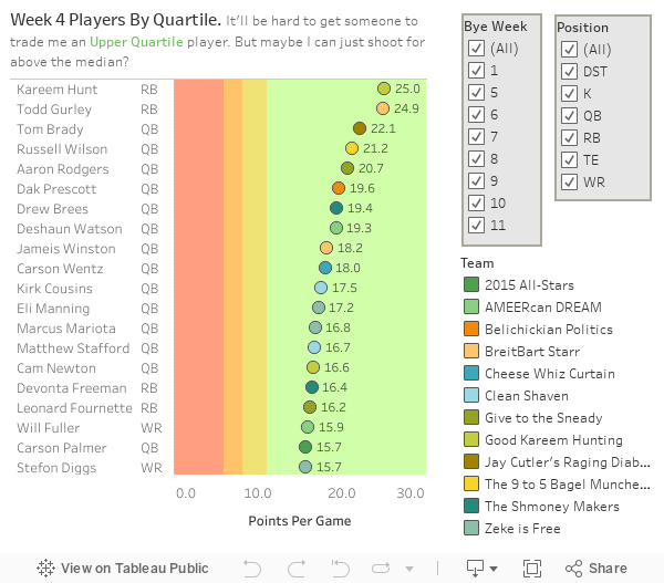
So I took our Game of Throwin’s rosters and joined it with publicly available fantasy football statistics, using data as of Week 4. My hope was that “seeing” it all in one place would help me more easily evaluate potential win-wins (and, ultimately, propose a trade that my league-mate would actually accept).

But this viz started to make me curious. How is it possible that Breitbart Starr has the highest performing roster in the league, but hasn’t won a matchup yet? Is it poor starting lineup management? How come Zeke Is Free looks average, but is undefeated? (And is en route to beating me this week…) Perhaps it’s more important that you have high-scoring stars who drive your starting lineup, versus a stockpile of better-than-average players, one-third of whom just sit on the bench anyway?

I played around with the data a bit more. I took all of the players who appear on our rosters and, by points-per-game, assigned each to a “scoring quartile.” So, at one end, the top 25% of players with the highest points-per-game will be in the Upper Quartile; at the other end, the lowest 25% will be in the Lower Quartile. That’s what you see here:

Then, I looked to see how each team stacked up in terms of how many high-performing players they had. Maybe this is a better predictor of our league standings?

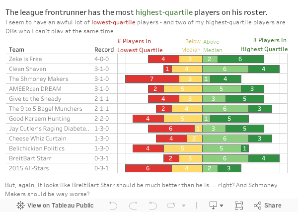
Welp. Inconclusive, huh?

OK, I do think I can make sense out of these analyses. I see the trend. Fantasy football performance is a freakin’ crapshoot. Maybe record and effort are unrelated. (Hey, Dana. Rationalize much?)

Readers, I promise to embark into the wild west of trade proposals. ESPN’s app didn’t make this easy, so I hope my data viz efforts pay off.

Any other ideas how I can use data and visualization to improve my performance? ANYTHING? PLEASE??? Comment below, y’all.

-Dd

The Grog Log Blog

Ever been to the Tonga Hut in North Hollywood? It’s the perfect tiki-bar-meets-dive-bar. The bartenders are always amazing. There’s a guy who sells tacos out of a tent in the parking lot out back.

But the absolute best thing about the Tonga Hut is the Grog Log. Here’s the story behind it. There’s this classic recipe book of tiki drinks called “Beachbum Berry’s Grog Log” (I highly recommend buying it – both for the recipes and the amazing historical sidebars). Based on this book, the Tonga Hut selected its own list of 78 classic tiki drinks, and issued to its patrons a challenge: anyone can start their own Grog Log, and whoever can finish all 78 drinks within one year gets to put up a plaque. Forever memorialized in the San Fernando Valley.

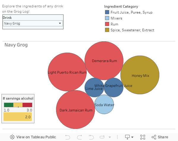
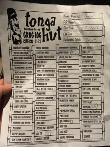
Obviously, I have my own Grog Log – which, to give you a visual, is just a sheet of paper, with my name on it, where the bartenders check off the drink when you order it. It’s kept in a plastic sheet protector, in a plastic file bin, on the bartop. Check it out, in all its glory (right).

But the one thing that’s been bugging me about the Grog Log – it only lists the name of the drink. Not what’s in it, or how boozy it is, or whether it will come to me on fire, or other meaningful questions in my decision analysis. While it’s fun to roll the dice – suuuuuure – I decided to create a Tableau data viz to help me explore the unknown.

So, I purchased the Beachbum Berry book, and turned this beautiful Grog Log into beautiful DATA!! Note that the viz works a little better on a desktop because of its size and its interactivity – but mobile can get the job done if that’s what ya got.


I like this explorer view for deciding whether or not I want any individual drink. But it doesn’t necessarily help in the decision-making process when faced with a list of potential options.

So I made a second data viz, with some Q&A features to help my fellow Grog Loggers narrow down their choices. My favorite feature is the Patrick Baker Button. This is a special shoutout to my buddy, who not only is the person who ushered in the Grog Log to our circle of friends, and not only is the person farthest along in his Grog Log, but who is also the birthday boy!!! He turns some indeterminate age today, and the Patrick Baker Button is my gift. (People like getting data for gifts, right? That’s a thing?)

One thing to note: You can see from these vizzes, roughly, the proportion of each ingredient. Sure, you can get out a ruler and measure the diameters of each circle to get the ratios. But out of respect for the Beachbum Berry author, I didn’t publish the value of the actual amounts. And I didn’t include any info on how the drink is prepared (e.g., whether it’s blended, what kind of glass to serve in, and so on), partly to respect his hard research but also party because that seemed really time-consuming and I have a full-time job, people. So for real, buy this tiki book. And buy yourself a volcano bowl. And throw your friends a party because, at some point, you won’t be able to afford going out because you’ve spent all your money at the Tonga Hut. Oh, and invite me!

Enjoy loggin’ them grogs, dataheads.

-Dd

P.S. Grog Loggers who beat the challenge get to hang a plaque “of your own making.” If I ever make it there, I’m about 90% sure I’ll label it as “Bob Loblaw’s Grog Log.” Any other suggestions? Or someone willing to talk me out of it?


Quasquicentennial Makeover

You’ve probably never heard of Lynch, Nebraska, but it’s a special place. For those readers not intimately familiar with rural Midwestern geography, Lynch is a farm town in northeastern Nebraska with a population of 234. That’s a metropolis compared to the next-closest town – Monowi, Neb., population 1. (That “1” is an amazing lady named Elsie who, naturally, runs the town bar. Monowi has actually received a surprising volume of popular media coverage.)

Reason #1 To Love Lynch: My dad is from there. And Papa Barnes rocks.

Reason #2: While Lynch High School alumni are now scattered all across the world – Nebraska and beyond – they’ve maintained such palpable pride in their roots. The town explodes every June for the annual Lynch High Alumni Weekend. I believe my dad graduated in a class of fewer than 10 people. And almost all come back, with their families in tow, for the yearly festivities.

Alumni Weekend typically entails a golf tournament, a town hall dinner, plentiful pool time, and ample cheap domestic beer. But 2017 is gonna be a doozy. This year is the town’s quasquicentennial. Lynch turns 125! In a truly commendable branding move, the town has dubbed it the (much more pronounceable)  Lynch Q125.

The Q125 organizers created a Facebook page, where someone had posted a flyer with the weekend’s itinerary. The flyer is flush with thorough, detailed information, with the event meticulously laid out in an eye-catching and shareable format. I imagine it took the author a tremendous amount of time to research, confirm, and format all the items. Truly, kudos to the author.

But in my information designer heart, I knew something important was missing. This is such hard-earned, highly-valuable information. I knew a different design could truly do it justice.

Here’s the makeover I came up with:

An ideal information design would effectively communicate key Q125 info – and maybe even increase attendance. I want to see Lynch packed to the proverbial gills this Father’s Day weekend (though now that I think about it, the added competition in the horseshoe tourney is not ideal for my prize-winning aspirations…).

You might be interested in a little insight on my thought process and the design tradeoffs I made. Here goes:

OriginalDataDana Makeover
TextFont and color variations, meant to grab attention and convey a sense of spiritedness, make it difficult to process the key event information quickly......whereas one font and a simple color scheme (Lynch High orange and black - Go Eagles!) improve readability.
GraphicsThe graphics are fun and help break up text......but reducing and simplifying the graphics make the flyer cleaner, and make the Lynch logo (which in my opinion is gorgeous) more prominent.
LayoutTwo-column format, similar to a newspaper or magazine, is good for narrative text, but......a calendar format lends itself better as a visual guide, conveying events that cross multiple days as well as the sequence within a day.
Social MediaThe original flyer was posted on the Facebook page......but adding a footer with the Facebook info could help improve traffic to the page, as folks share and print this flyer outside of the Facebook platform.
Reppin' Local BandsThe original includes the logos for two local bands playing Friday and Saturday. I wavered a lot on whether to keep these, because (1) I'm sure the bands appreciate (or maybe even asked for) the advertising, and (2) it's more likely to catch the eye of people who are fans of the band......but tradeoffs are sometimes needed. I prioritized event information readability and comprehension, targeted to a wide audience. But if these bands are keynote events, or if there was a strong need for the band-specific banners, then I'd have to take another whack at how to incorporate this.

I’m also willing to share a couple of my handy tricks. First off, I did this all in PowerPoint (seriously!), so don’t feel like you need fancy software to produce something cool. Second, the simple graphics come from my go-to logo library, thenounproject.com. (Attribution time! Motorcycle by Edward Boatman, Golf by Hopkins, Flags by Aldric Rodriguez)

My final handy trick? I think Lynch is great, and my heart yearns for this Q125 to be the best ever. So putting your heart into these things is always a major plus.

Before (Original)

After (DataDana Redesign)

Who else is coming? In which events would you like to challenge me? Any other design ideas or event poster inspiration? Use the comments below and tell me what ya think.

-Dd

The Meat Photo: An Interactive

Back when I was a lowly college sophomore, my dormmates and I had an innocent courtyard grill-out. The evidence, beautifully captured by Facebook photo auteur Tad. Each of us who partook were tagged with our respective offerings. Mine, a veggie skewer a.k.a. a Dana-kebab.

Faster than we could drop my skewer through the grill bars (why didn’t we grill perpendicular?!), this photo thread got out of control. Since this fateful day – May 6, 2007 – The Meat Photo has continually haunted my Facebook notifications and newsfeed.

On its first couple days online, somehow (hypothesis: I think it was finals week), we went bananas on the comments. In the ensuing weeks literally hundreds of comments were added. Mostly uncouth euphemisms that I won’t repeat here.

I should put this in perspective. Today, getting hundreds of interactions on something you post isn’t uncommon. But this totally wasn’t the norm at the time. To illustrate, let me tell you what Facebook was like in May 2007:

  • My URL was still bookmarked to TheFacebook.com
  • Whenever I wrote a status, it had to follow the syntax “Dana is…”
  • There were no “like” buttons
  • Even just a few months prior, the homepage used to only display your friends’ birthdays your outstanding pokes
  • I still received an email alert whenever anyone wrote on my wall or commented on a photo of me


…OK, let me level with you. I pretend to be irritated by this photo. But the truth is, I love it the most. Because to this day, every few months, someone re-ups the thread; which unleashes a flurry of comments from all involved; then it goes dormant for another six months until the cycle repeats. This has gone on for nearly a decade. This photo is practically folklore.

The most recent comment storm called out some ground-shaking information. As the commenter pointed out, this week is the ten year anniversary of this stupid facebook post!!!! And there’s even talk of a reunion, bringing together people from Nebraska to California to both Washingtons. You guys. This would rule.

So, in honor of this momentous occasion, I bring to you: a too-deep deep dive into the ridiculousness that is The Meat Photo.

This data raises important questions. First, we need to talk about why nobody posts at 2:00 p.m, even though presumably we’re all awake; are you all hanging out without me? Second, did George Clinton really comment on this thread in October 2012?

And most importantly…can we hit 1,000 posts before this pic’s tenth birthday? Whoever posts the 1,000th post, you’re getting an entire pitcher of Elk Creek Water, DataDana’s treat.

Dd

LA Public Transit: Quantitatively, Doesn’t Totally Suck

My boyfriend, Brian, is a unique dude in many wonderful (read: weird) ways. Just one example: He is a Los Angeles resident who takes public transit to work every day. RIGHT?

With Brian, the commute math works, time-wise. His particular route, the traffic is so egregious, that a train ride turns out to be about equivalent to driving. “Competitively convenient,” as I call it. (An aside: I would even take a 50% increase in my commute time if I could do it via transit, because I could read and space off. I would actually love to see some studies on this.)

But the math that shocked me? The unlimited pass for the LA Metro Rail is such a bad deal! Brian informed me that a one-month pass was $100. I honestly didn’t believe it at first. For a city with such congestion problems, incentivizing people to get unlimited and take transit as much as possible should be a priority.

So we did some back-of-the-envelope math (technically, back-of-the-coaster-at-the-bar-where-we-were-having-happy-hour math). Each one-way on the LA Metro is $1.75. To make the unlimited pass worth it, Brian would need to take 58 trips. But that number was kind of hard to conceptualize, so we put it terms of his work calendar. Ok, so: That’s to and from work every day plus at least one round trip on every single weekend day, with just one day in the month where you didn’t ride. That’s just to make it worth the tradeoff. You’d have to ride even more to get any “bonus rides.”

I tried to recollect: Were New York and Chicago this bad of a deal, too? Was I just carless and careless? I did some research and, turns out, LA’s unlimited pass is indeed the worst deal of the nine largest transit systems:

Quick note: You may have noticed this list excludes D.C., where fares are based on distance traveled (versus one universal fare regardless of where you enter and exit), so was harder to compare to all the others. I’m sure there’s a way to make them mathematically comparable. But, eh, my priorities are elsewhere tbh.

What this calendar view viz tells me is that, unless I’m a truly dedicated user of L.A. Metro Rail (or if I’m doing an LA Times-sanctioned Red Line Bar Crawl), an unlimited pass almost never makes sense. Whereas in cities like San Francisco, Boston, and Atlanta, even people who solely use it for commuting get some freebies. Bah!

I, just a casual transit user, have no business buying an unlimited pass. But even for dedicated commuters like Brian? He’s not getting any bonus rides from this deal. So the economics results in Brian simply buying single-ride passes – only when he needs it – and not having any incentive to take the train in other circumstances.

Alas, deep down, I love the LA Metro. It gets me to the beach, and to the amazing food spots downtown, and to Universal CityWalk Jimmy Buffett Margaritaville. So to redeem my beloved train network, I went on a search for other ways to assert its quality.

Turns out, LA has one of the cheapest single-ride fares. Huzzah! Which is why, mathematically, its unlimited pass looks like such a bad deal. (Theoretically, Garcetti could just increase the single-ride price, making the unlimited look like a better deal, thereby gaming my metric system. But I don’t think the Mayor’s Office is combing through itsdatadana.com for policy inspiration.)

It also turns out that the sheer length of the LA system is pretty good. We’re a sprawling city, planned and extended with the car-based aesthetic of the mid-20th century. Aw, LA Metro, little buddy, you’re doing your best. Even if you’re not taking home the gold, I’m glad you’re in the race.

BONUS: I’ve mentioned bars thrice in this post. Let’s make it four (frice?). I think the title of this LA Magazine article sums it up: “A Local Hero Has Mapped Every Bar Within Walking Distance of the Metro.” A salute to you, sir.

Dd

“Bod”-havioral Economics Part One: Experiment Design

In exactly 6 weeks and one day (plus the duration of one red-eye flight with a tragically long layover in Orlando), I will be on the island of Jamaica. In a villa. On the ocean. As a bridesmaid. This is a vacation where photos will abound.

I already know I’ll be joy-crying nonstop, disheveling my makeup in every shot. But for the photos where I can KEEP-IT-TOGETHER-DANA? I want to feel great and look good. Enter: Operation Beach Bod.

Fortunately, I’m not the only wedding-goer hoping to be at their best for the occasion. My friend Kelsey texted me the following at the end of February (I’m paraphrasing and removing profanities below):

I have an idea with fitness motivation. What if we start a Facebook group and we have a challenge for March. Everyone puts in $10, and if you’re successful, then you get your name put into a drawing at the end of the month. Winner gets the pot.

As a junkie of the behavioral economics non-fiction genre (think Freakonomics, Nudge, Switch, Blink, and other catchy one-word titles with lengthy, wonky subtitles), I was totally on board. Not only is this a financial incentive, but there’s a social disincentive at stake. Add in the fact that I’m intrinsically competitive? Let’s do this.

After some back and forth, Kelsey and I teased out the parameters – and even recruited three other Jamaica-bound souls to join this experiment with us. Here’s what we came up with:

Kelsey and I made some key decisions in the experiment design that are worth calling out.

  • Each person should set their own individualized goal (something challenging and meaningful), as opposed to all of us sharing a group goal. Goals should be about doing something positive, like exercise, rather than something restrictive, like dieting.
  • Instead of designing a one-month goal with a one-month prize, each person sets a goal for each week, with one raffle entry per successful week. That way, if you get off track in week 2, you still have motivation to get back on track for weeks 3 and 4. Plus, the shorter cycle for positive feedback and milestone achievement seemed smart.
  • We needed to recruit at least 4 people to the group to make the final prize seem, well, prize-worthy.

It’s a variation on stickK.com, a behavioral economics-inspired web platform where you make a “commitment contract,” recruit a “referee,” and set your “financial stakes.” But, to me, something was always weird about the unidirectionality of this model. If I’m the person who wants to achieve a goal, I have to get others to agree to support me and hold me accountable. What do the supporters and referees get out of this?

With the DataDana variation, the challenge, support, and accountability flows in all directions. It’s multiple people asking each other. Plus, my variation has the added conceit of the gamble – a chance at multiplying your financial stakes. Yes, most participants will lose their money. But $10 is low enough that it won’t be missed, practically speaking; and $50 is high enough that it feels like a prize. If I win, I’m treating myself and one lucky dining companion to drinks and cheese at my local supermarket’s on-site bar. (One night of rosé and manchego won’t unravel all that hard work. Right?)

We are currently in Week 4 (of 4) in the Bod-havioral Economics experiment. After Sunday? I’ll update you dataheads with the results and some bonus analytics.

Dd

Say Rent to the Tent?

I’m at the age where all my travel plans this year involve wedding-related events. I personally love it. I’m a sap for romance, I love a good open bar, and weddings are endless fonts of quantitative inspiration. (For example, FiveThirtyEight has a fun post about most-played songs at wedding receptions.)

So when my friends Eling and Dan shared their wedding tent rental dilemma, I jumped at the chance to wrap my brain around some data. Here’s the situation, paraphrased from an email from Eling:

Most tent companies require you to order your tent at least five days before the wedding. Tents cost upwards of $1,500. The forecast is looking good as of now, but forecasts can be so unreliable in Miami. What should we be willing to pay to ensure our guests don’t get rained on? Is there a magical formula that can calculate when it’s worth it?

I love this question. There are actually two parts to it. One, how reliable is a 5-day forecast? And, two, how can the couple use the information available to decide on this big ticket item?

For #1, I gathered data about Saturdays (i.e., most popular wedding days) from 2011-2017 in Miami in March. I got data on whether it actually rained from the Weather Underground’s weather history site. The trickier part was figuring out what had been predicted for that day five days earlier. (I’m guessing for-profit weather sites don’t want people criticizing them for poor predictions, so don’t make these easy to mine.) But after some deep Googling just shy of the Dark Web, I found a workable resource from the U.S. National Oceanic and Atmospheric Administration (NOAA). Using their Weather Prediction Center Medium Range Archive, I could look up the date of the Monday that preceded the wedding and see what the predicted precipitation had been for the Miami area.

I kind of love the behavioral economics lessons in this graph. Let’s say you’re a couple who faced a forecast of 0-10% and, therefore, you “gambled” not to rent. On 9 out of 10 of these Saturdays, their gamble worked out. Spend that money on your honeymoon, lovers! But does that mean the  3/29/14 couples who ended up with 0.36 inches of rain make a bad choice if they, like the other 0-10%ers, didn’t rent? Not necessarily! They had the exact same information as the other 0-10% couples. The chips just didn’t fall their way.

I mean, think about it the other way. If the forecast was for 80-90%, most people would be safe and rent a tent. But there are probably couples who “gambled” not to rent, and it turned out not to rain. Does that mean they’re meteorological savants? Unlikely. I would argue that they made a bad choice even though they had a good outcome. There’s a principle in behavioral economics that “one should be judged not by the outcome of a decision, but by the process that led to that decision.”

That brings us back to #2: what is a good process (a “magical formula”) for making this decision? I propose using the tool below, a Tableau interactive which finally puts all those years of econometrics to good use:

Fortunately, March is one of the least rainy months in Miami; so chances are, Eling and Dan will have a clear forecast and will only have to make decisions on the left-hand, sunny-forecast side of this graph. But this “fortune” is also, unfortunately, the grey area. Choosing not to get a tent will always be a gamble.

How willing you are to make this gamble depends on whether you’re willing to accept a little risk. And this risk-averseness is harder to model without doing legit tent consumer research. While I added some guidance into the interactive, I couldn’t figure out a way to make this more cut-and-dried. Sorry, dudes.

Would love to hear your thoughts, dataheads! Is there a way to make the “grey area” more black-and-white? Do you have any good weather data resources?

Dd

Splitwise’s Math Problem

Math puzzle nerds, like me, love the challenge of splitting expenses. Whether it’s roommate bills or a restaurant check, figuring out who owes who what can be a weirdly gratifying duty. (My dream job, as depicted on Portlandia.)

So when I heard about this new app called Splitwise, I thought my skill would be made totally obsolete. Basically, you enter group expenses into the app, Splitwise does all the calculations, and uses your PayPal/Venmo/etc account to “settle up.”

While all you people with real lives and real hobbies probably love this, I was initially reluctant to forsake my beloved spreadsheet matrices. But I caved. I gave Splitwise a whirl at a (delightful!) nine-lady bachelorette party last weekend.

And I have to confess: Splitwise is pretty great. The user experience is intuitive, it’s easy to make different subsets responsible for different expenses, and users do zero calculations to figure out the transaction requirements/amounts.

But, dude. The way Splitwise does this is, to put it in technical terms, inefficient AF:

The way I’ve always done this math is a little different. I basically try to minimize the number of transactions needed. This is probably a relic of pre-Venmo days, when we all actually had to write physical paper checks to one another. Instead of wasting checks for every one-on-one balance, I’d basically say: OK. If I put $541.78 into the “group balance sheet,” but I only owed $225.87 to the group, all that matters is that I get $315.91 back from the group somehow. I give zero craps about who it actually comes from. Similarly, if Joslyn owes $218.87 to the group, it doesn’t matter to her who she pays it to.

So, to balance the cash flow while minimizing transactions, I just MATCH people who owe the group (owe-ers) to people who are owed by the group (owe-ees).

Why does this matter? Some users may have transaction fees associated with their bank account or with the payment app they associate with Splitwise. Plus, all these transactions clog up my Venmo feed, which is normally a very fascinating window into my social network’s financial habits. And also, efficiency for efficiency’s sake!

But I could see why Splitwise does this. For one, it promotes their app multiple times over across multiple Venmo feeds. Free publicity, baby. But importantly, if there’s a stinker in the group who doesn’t pony up? The effect is spread among everyone. For example, if Joslyn snaps and goes off the grid and never settles her tab, five of us share the brunt rather than just Claire.

What do y’all think? Any other bill splitting methodologies out there? Anyone think they can get fewer than 8 transactions out of this scenario? Download the data and explore my Tableau Public workbook.

Dd