You’ve probably never heard of Lynch, Nebraska, but it’s a special place. For those readers not intimately familiar with rural Midwestern geography, Lynch is a farm town in northeastern Nebraska with a population of 234. That’s a metropolis compared to the next-closest town – Monowi, Neb., population 1. (That “1” is an amazing lady named Elsie who, naturally, runs the town bar. Monowi has actually received a surprising volume of popular media coverage.)
Reason #1 To Love Lynch: My dad is from there. And Papa Barnes rocks.
Reason #2: While Lynch High School alumni are now scattered all across the world – Nebraska and beyond – they’ve maintained such palpable pride in their roots. The town explodes every June for the annual Lynch High Alumni Weekend. I believe my dad graduated in a class of fewer than 10 people. And almost all come back, with their families in tow, for the yearly festivities.
Alumni Weekend typically entails a golf tournament, a town hall dinner, plentiful pool time, and ample cheap domestic beer. But 2017 is gonna be a doozy. This year is the town’s quasquicentennial. Lynch turns 125! In a truly commendable branding move, the town has dubbed it the (much more pronounceable) Lynch Q125.
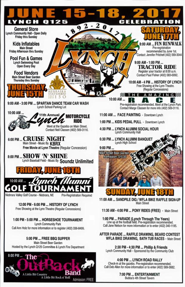
The Q125 organizers created a Facebook page, where someone had posted a flyer with the weekend’s itinerary. The flyer is flush with thorough, detailed information, with the event meticulously laid out in an eye-catching and shareable format. I imagine it took the author a tremendous amount of time to research, confirm, and format all the items. Truly, kudos to the author.
But in my information designer heart, I knew something important was missing. This is such hard-earned, highly-valuable information. I knew a different design could truly do it justice.
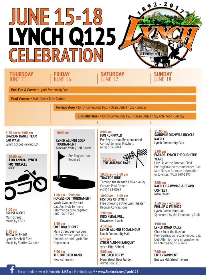
Here’s the makeover I came up with:
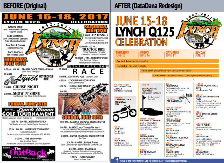
An ideal information design would effectively communicate key Q125 info – and maybe even increase attendance. I want to see Lynch packed to the proverbial gills this Father’s Day weekend (though now that I think about it, the added competition in the horseshoe tourney is not ideal for my prize-winning aspirations…).
You might be interested in a little insight on my thought process and the design tradeoffs I made. Here goes:
| Original | DataDana Makeover | |
|---|---|---|
| Text | Font and color variations, meant to grab attention and convey a sense of spiritedness, make it difficult to process the key event information quickly... | ...whereas one font and a simple color scheme (Lynch High orange and black - Go Eagles!) improve readability. |
| Graphics | The graphics are fun and help break up text... | ...but reducing and simplifying the graphics make the flyer cleaner, and make the Lynch logo (which in my opinion is gorgeous) more prominent. |
| Layout | Two-column format, similar to a newspaper or magazine, is good for narrative text, but... | ...a calendar format lends itself better as a visual guide, conveying events that cross multiple days as well as the sequence within a day. |
| Social Media | The original flyer was posted on the Facebook page... | ...but adding a footer with the Facebook info could help improve traffic to the page, as folks share and print this flyer outside of the Facebook platform. |
| Reppin' Local Bands | The original includes the logos for two local bands playing Friday and Saturday. I wavered a lot on whether to keep these, because (1) I'm sure the bands appreciate (or maybe even asked for) the advertising, and (2) it's more likely to catch the eye of people who are fans of the band... | ...but tradeoffs are sometimes needed. I prioritized event information readability and comprehension, targeted to a wide audience. But if these bands are keynote events, or if there was a strong need for the band-specific banners, then I'd have to take another whack at how to incorporate this. |
I’m also willing to share a couple of my handy tricks. First off, I did this all in PowerPoint (seriously!), so don’t feel like you need fancy software to produce something cool. Second, the simple graphics come from my go-to logo library, thenounproject.com. (Attribution time! Motorcycle by Edward Boatman, Golf by Hopkins, Flags by Aldric Rodriguez)
My final handy trick? I think Lynch is great, and my heart yearns for this Q125 to be the best ever. So putting your heart into these things is always a major plus.
Before (Original)
After (DataDana Redesign)
Who else is coming? In which events would you like to challenge me? Any other design ideas or event poster inspiration? Use the comments below and tell me what ya think.
-Dd