It’s almost Halloween, dataheads. And I came across quite the fright as I scrolled through Twitter today.
I got a promoted tweet for Texas Senate candidate Beto O’Rourke, soliciting campaign donations. And this data viz? Insert scary movie score here. Take a look.
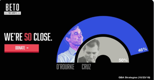
What grinds my gears about this is that it violates a data visualization tenet: never be visually misleading. But here, it both misrepresents Beto’s position in the race and confounds his call-to-action for donations.
Why? Well, Beto’s “rainbow” takes up more real estate on the graphic than Cruz’s. It has more volume, more length, and has a longer arc. My brain looks at the picture, and before it has a chance to process the labels at the ends of the arcs (46% vs 50%), I might conclude that Beto has overtaken Cruz. So not only is it an inaccurate rendering, but it might actually make me think Beto doesn’t need my ten bucks.
Yes, I see that Cruz’s arc is more “complete,” I guess, than Beto’s (and I do like, visually, stacking Beto on top of Cruz to give a sense of victory). But this is marketing disguised as data.
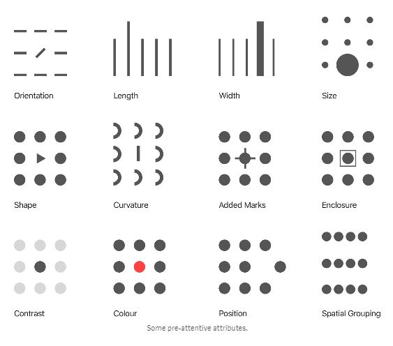
The point of data visualization is that it capitalizes on our brain’s “pre-attentive attributes.” If designed well, when we look at an image, our eyes go immediately to the pattern we’re supposed to recognize — or the discrepancy we’re supposed to notice.
So I played around with a couple different options for getting Beto’s message across while still representing the data truthfully and compellingly. I tried a few options with donut charts (which is what the original designer used, essentially). But differences in angle just aren’t that powerful to the eye, in my opinion. That’s why I’m loathe to use pie charts.
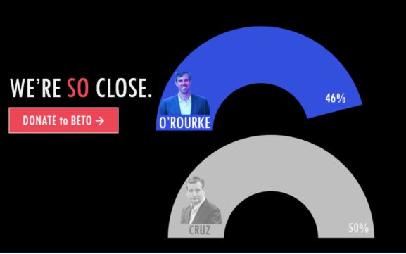
But then I realized, you can do some subtle things with font sizes and colors to make Beto stick out, without distorting the chart itself. In fact, simplifying the chart could actually make it more powerful!

Getting rid of the unnecessary curvature effect actually makes this better. And it gave me more options for playing around with the label size and colors. My eye can go to Beto (because he’s the important one in this ad), but my eye can also see that gap in the polling numbers.
Any other thoughts on ways to improve Beto’s message? Anyone else want to toss $10 Beto’s way? Comment away, dataheads.
-Dd