Hot take? In general, recipes are pretty terrible information design. They’re written as if cooking follows a neat linear path. But what if there are steps that belong together? What work can simmer in the background while I multitask on an upcoming part? Where are the natural divisions of labor so another person can pitch in? Cooking a meal is 3-dimensional choreography; most recipes are flat, linear, one-way roads.
(A couple notable exceptions: I love how HelloFresh breaks down their recipes in a visual, compact card with clear phases. Molly Baz’s Cook This Book helpfully chunks the recipe into its component goals, and uses neat QR codes for technique how-tos.)
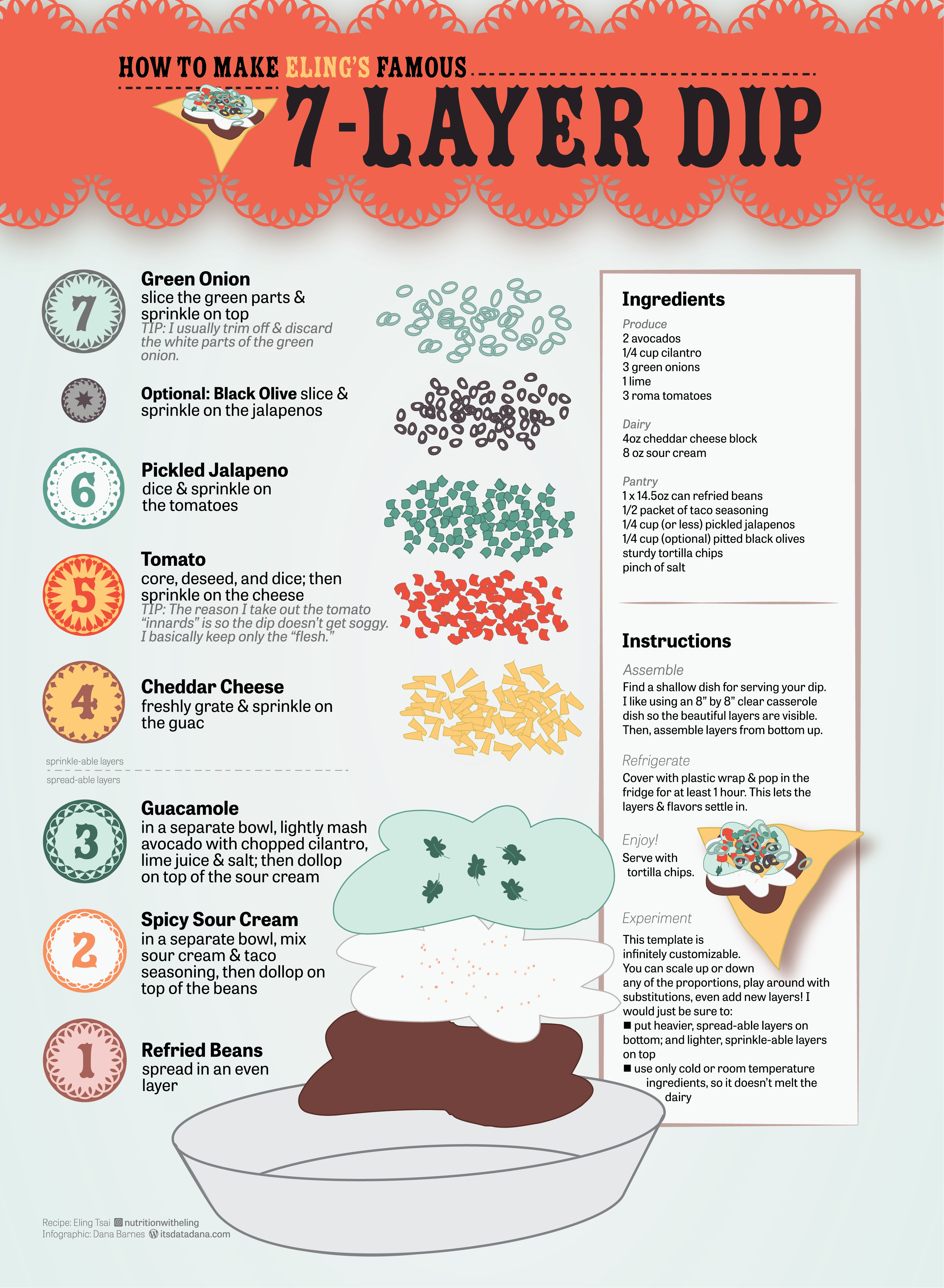
The worst offenders are recipes that involve layering – like dips, lasagnas, desserts. The information on the page flows from top to bottom, all while you’re building in a dish from the bottom-up. I always end up with layers that are over-distributed, under-distributed, misplaced, or skipped altogether. It would be so much easier to see how the layers stack up as a visual, and follow along as you’re building alongside the image. Imagine that: A recipe that flows the same way my dish does.
Enter: Eling’s famous Seven Layer Dip. This impeccable dip comes from the mind & kitchen of Eling Tsai – who is an incredible home chef, a bona fide registered dietician, and one of my very best friends on this earth. I don’t have receipts from when she first shared this gem with me, but I have an iPhone note I created about 7 years ago which has been my layer dip bible over ever since. Not exaggerating, when I bring this dip to a party, the entire casserole dish is wiped completely clean.
A couple months ago, I got the idea that I wanted to do something with this cherished recipe. I was horrified by the idea of ever losing the iPhone Note. I wanted to memorialize the Seven Layer Dip as an infographic, forever living in internet permanence, for the world to be able to know how amazing Eling’s creation is. I sketched many, many ideas on loose printer paper around my house – I imagined blueprints, technical diagrams, all sorts of non-traditional recipe formats to really visualize how the end product comes together.
Unfortunately, there was a problem. I had all these ideas, but not the design skills to get even close to executing it. My background is in Tableau, slides, and spreadsheets. The vision in my brain was beyond the limit of what my PowerPoint skills (while mighty!) could do.
After a little research on what tools could bring my concept to life, I settled on Adobe Illustrator. Am I saying I took an entire summer quarter class at UCLA so I could make a Seven Layer Dip infographic? I’d say this is 50% true; this recipe infographic was more so the final straw that pushed me to learn something beyond my current means. But, y’all. I am only 4 weeks into this class and this is the level of what I’m able to create! I’m sure I will look back and nitpick it, but I’m really proud! I can’t wait to see what other infographic ideas I can unlock with this new toolkit. Here is the class info if others are interested.
Worry not – I am certainly not saying goodbye to the DataDana that brings you hypernerdy Tableau interactives. But I am excited to be able to broaden my dorky side project horizons. (And yes – I’ve even started using Illustrator at work. I can’t believe how much hacky stuff I was trying to do in Google Slides all these years!!)
Do you have any recipes that you wish were visualized? Anyone else loving Illustrator for their data work? Comment away, dataheads!
-Dd
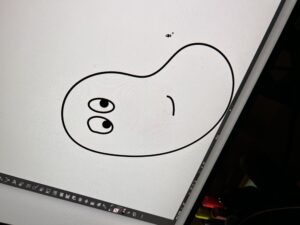
P.S. For those learning Illustrator, know that it is taking lots of time and practice. It’s worth getting the hang of that frustrating pen tool, the mechanics of text wrapping, the value of well-organized layers. I’ve come a long way; check out my attempt to draw a bean in week 3.
